Pay in working class jobs
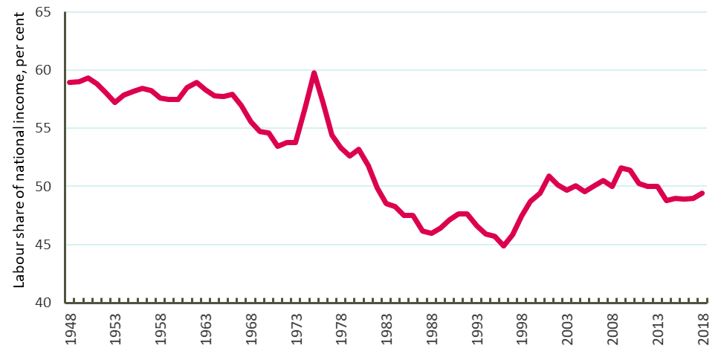
Looking at the broadest definition of ‘working class’, those who work for a living, we know that the share of national income going to labour has fallen since sustained highs in the post-war decades.
Data from the ONS show that the labour share of national income fell substantially during the 1980s, broadly flatlined since the turn of the century and has deteriorated a little under austerity.
Chart 1: labour share of national income since 1948
Looking within the pay distribution however shows that these losses haven’t been fairly shared.
Our analysis looks at median pay, depending on occupation, to find out how different types of jobs have been valued over time. The data, from the ONS Annual Survey of Hours and Earnings (ASHE), allows us to look back to 2002, and to compare the eight years to 2010 – the start of austerity – to the eight years after. [2]
We’ve broken down these occupations into four broad groups, to look enable us to look at changing trends. We also do a simple comparison between occupations paid above the median wage, and occupations paid below.
The table below sets out how we’ve defined these groups and some basic information about them.
[2] Data is from Annual Survey of Hours and Earnings (ASHE). Average pay for the occupations in the four broad groups has been weighted according to ASHE estimates of the number of employees working in each occupation. Data on the demographics of occupations, covered later in this report, is from the Labour Force Survey (LFS), and is an average of all quarters in the year has been taken.
|
Pay range in 2018 |
Number of people employed in 2018 |
|
|
Low earners Those in jobs earning below 75 per cent of the hourly median wage |
Below £9.60 an hour (around £17, 500 a year if working a 35-hour week [3] ) |
7.1 million |
|
Low -middle earners Those in jobs paid between 76 and 100 per cent of the hourly median wage |
Above £9.60 but below £12.70 an hour (Between around £17,500 and £23,260 a year if working a 35-hour week) |
7.7 million |
|
Below median Those in jobs paying below median wages |
Below £12.70 an hour (around £23,100 if working a 35-hour week) |
14.7 million |
|
Above median Those in jobs paying above median wages |
Above £12.70 an hour (around £23,100 if working a 35-hour week) |
12.7 million |
|
Middle-high earners Those in jobs paid above median but below twice the median hourly wage for all jobs |
Above £12.70 an hour but below £26 an hour (between around £23,100 and around £47,000 if working a 35-hour week) |
11.5 million |
|
High earners Those in jobs paid twice the median wage and above |
Over £26 an hour (over £47,000 if working a 35 hour week) |
1.2 million |
[3] In reality, working hours vary by occupation, and workers may have little choice over number of hours worked
Chart 2: Average hourly pay in jobs paid above and below median earnings, 2002-2018
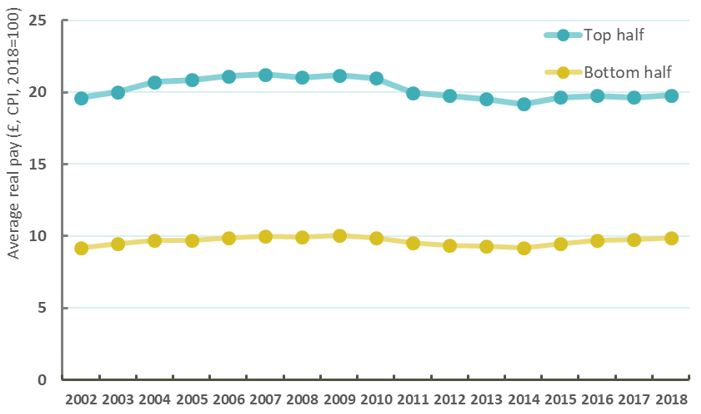
Chart 2 shows changes in average real pay in jobs above and below median pay since 2002. It shows that:
- Before 2010, pay grew at around the same rate in both the top and bottom half of the distribution; with pay growth of 7 per cent in the higher paid jobs, and 8 per cent in lower paid jobs.
- In cash terms, this meant higher pay rises for those in the top half – worth on average £1.37 an hour for the top half of earners, and £0.70 for those in the bottom half.
- After 2010, with the minimum wage protecting the bottom half of earners, the top half fared slightly worse. Between 2010 and 2018, real pay in jobs paid above the median fell by 6 per cent – worth £1.18 an hour. Real pay in jobs paid below the median stayed completely stagnant, the same now as it was back in 2010.
Chart 3: Average real hourly pay in jobs at various parts of the pay distribution, 2002-2018
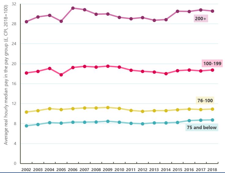
Chart 3 breaks this down further to look at the experience of different groups in the labour market, as set out above. It shows that:
- Prior to 2010, pay growth was fastest in percentage terms for the lowest paid jobs
- Pay for those in jobs paid less than 75 per cent of the median grew by 10 per cent (£0.76)
- Pay for those in jobs paid between 75 per cent and the median wage grew by 7 per cent (£0.73)
- Pay for those paid between the median and twice the median wage grew by 6 per cent (£1.16); and
- Pay for high earners – those paid twice the median wage grew by 4 per cent – though this was the largest in cash terms at £1.27.
- After 2010 both middle paid groups have seen their pay fall, with only the bottom and top paid groups seeing rises in pay.
- The lowest paid jobs have seen pay increase by 5 per cent (£0.43)
- Pay for low-middle earners has been basically stagnant – and is in fact now £0.14 below its 2010 level.
- Pay for jobs between the median and twice the median has also fallen – by 3 per cent, or 61 pence an hour.
- Pay for those jobs paid at twice the median wage has risen by 4 per cent – the largest cash rise again at £1.27.
So while all working people have suffered, only the lowest paid working class jobs have been protected by falls in pay by the minimum wage, while the best paid jobs have seen their pay rise again.
Stay Updated
Want to hear about our latest news and blogs?
Sign up now to get it straight to your inbox
