What does the OBR tell us about the impact of austerity on productivity?
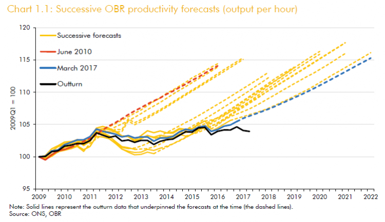
The chart also shows that over the last eight years the OBR have clung doggedly to the hope that ‘next time it will be different’. This week they were putting us on notice that they are likely to give up that hope.
Many commentators are drawing the conclusion that without productivity there can be no government spending. And so the government is in an even tighter spot than it already thought.
But the counter to this hopelessness is that if the government changed its own policy approach things might be different. My colleague Kate Bell discusses reasons for cheerfulness here.
On this view productivity outcomes over the past 10 years are not a constraint on government action, but a result of government inaction. And if the argument holds that a lack of demand is holding back productivity, then the response to the poor productivity figures should not be to hold back demand still further.
So what do the OBR say about the balance of supply and demand side factors in explaining the productivity ‘puzzle’?
They start with an overview of all the various possible supply-side factors and seemingly find no explanation particularly compelling. As Ben Chu of The Independent suggested at the press conference, instead the OBR are simply planning to project on the basis of past outcomes.
They then OBR touch on demand-side factors (Box 2.2, p. 25). This kind of analysis must be done via the multiplier (see ‘why multipliers matter’) – the concept which explains the extent to which a cut or increase in government spending has impacts on the wider economy
There is very little novel in this analysis. Each year the OBR observe that “there is significant uncertainty around fiscal multiplier estimates”. Each year they note that multipliers would need to be significantly bigger in order to explain the scale of economic weakness since 2010. They also argue as a matter of opinion rather than an analytical result that a Eurozone crisis in 2012 is a more compelling explanation for the most severe weakness.
They then make a more general argument around how the pattern of economic weakness from year to year does not conform to the scale of austerity from year to year. This year the OBR use a chart to make the point.
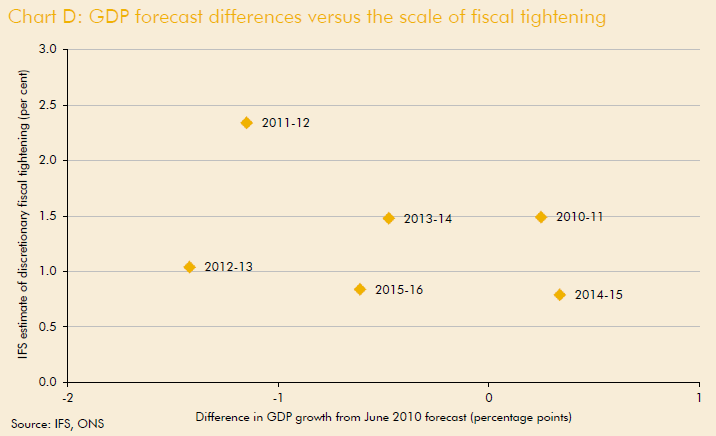
Their implicit claim is that if the demand argument was correct then we should get a straight line with a negative slope, so that years with higher tightening (i.e. bigger cuts) are associated with more negative differences in GDP growth from their forecast. In fact the relationship is not exactly dreadful, it is negative and the correlation is around -0.3 (just by reading figures off the chart). We note too (more anecdotally) that the years when the GDP difference was positive are 2010-11 – when there was probably some residual effect from the recovery under Labour’s stimulus – and 2014-15 – when the government reduced cuts ahead of the election.
But the analysis depends also on whether the IFS estimates of fiscal tightening (that the OBR use) are the most relevant measure for this sort of analysis. Their approach is based on summing announced changes in tax and spending plans since the start of austerity, which leads to a level of cuts in individual years (relative to a 2008 baseline). It is not clear whether this fully captures the extent of austerity in a macroeconomic sense. And it seems a bit extreme to expect changes in GDP from year to year to conform exactly to changes in these levels, given likely lagged and delayed effects and all sorts of other stuff going on (not least QE).
The approach that we have used in our analyses of cuts is to look across groups of several years, comparing growth outcomes over the pre- and post-crisis period. [Here , section 4] we showed how there was since the crisis a reduced average annual contribution of government spending to GDP of 1.3 percentage points and an average annual reduction in GDP growth of 1.8 percentage points (with figures in nominal terms). This conforms broadly to a multiplier of around 1.5 (i.e. 1.3 percentage points reduction in government spending x 1.5 = 1.9 ppts reduction in GDP). While this is a one off result, the key is that the growth relationship holds good when looking at all OECD countries (additional detail here).
Change in GDP (Y) versus change in the government contribution
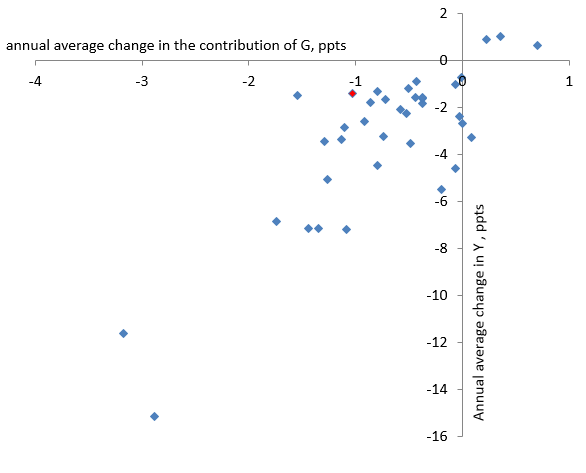
Source: OECD figures and TUC calculations, see here
The chart shows a clear relationship between reductions in government expenditure growth and GDP growth, suggesting growth is a good measure to use. And the relationship between the size of cuts and the impact on GDP is strong: the correlation is a healthy 0.65 and the slope suggests an average multiplier across the OECD of close to 3.
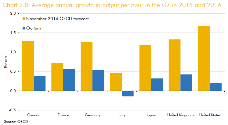
The OBR do bring to bear some international evidence to show that the productivity puzzle is not exclusive to the UK, with the below chart of productivity outturns against forecasts for major economies. But they do not bring any international evidence to bear on their analysis of multipliers.
To focus on the supply-side alone is to avoid a key way in which we could tackle the productivity crisis. Austerity is not the natural policy response to these figures but a hugely controversial course of action. Back in the real world, the implication is that the productivity ‘puzzle’ could be at least partly solved, if the government acted. And until then working people will continue to get it in the neck.
Stay Updated
Want to hear about our latest news and blogs?
Sign up now to get it straight to your inbox