Real wages are still falling – so why is disposable income (just about) rising?
New ONS figures, released yesterday, show that working households’ disposable incomes have inched above the peak 2006/07 levels for the first time.
But the meagre rate of increase – just 0.2 per cent a year – showcases what a dreadful decade it’s been for working people’s incomes. For context, in the previous ten years average annual income growth was more than ten times higher at 3.3 per cent.
The ONS figures are shown on the chart below – with the incomes for non-retired (basically equivalent to ‘working’) households (in purple) above their 2006/07 pre-crisis peak for the first time in 2016/17. Previously the busting of the pre-crisis peak was down to steady and consistent increases in the incomes of retired households.
Median equivalised disposable household income measure, £ real terms
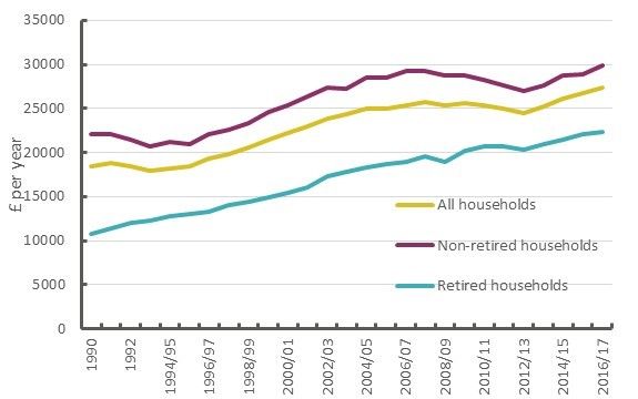
In cash terms, non-retired household income is now up £650 on before the crisis, in the previous ten years it rose by £7,200 (corresponding to the percentage changes mentioned earlier).
And while exceeding the pre-crisis income peak is a milestone, it’s a topsy-turvy one considering that real wages are still down on pre-crisis levels, by an average of £38 a week (see here), and expected to fall further this year.
So what’s going on? If most of the country is facing falling real wages, why do the new figures show rising incomes?
So why are incomes up?
First and obviously as well as wages, disposable incomes include benefits payments, tax credits and pension payments and are adjusted for taxes and national insurance payments. These act automatically to moderate changes in wages, more so if policy is changed.
But the most important factor over recent years is jobs. If the number of people in work increases, then average incomes can rise even when wages fall. Take for example the following purely hypothetical example. In year one, nine people are earning £20 and one earning nothing. In period two everybody is earning £19.
The average rises from £18 to £19, but all the people working in year one were earning less.
That’s in part what’s been going on in the UK labour market. On the chart below, financial year (real) wages and salaries figures are decomposed between employment and (real) earnings.
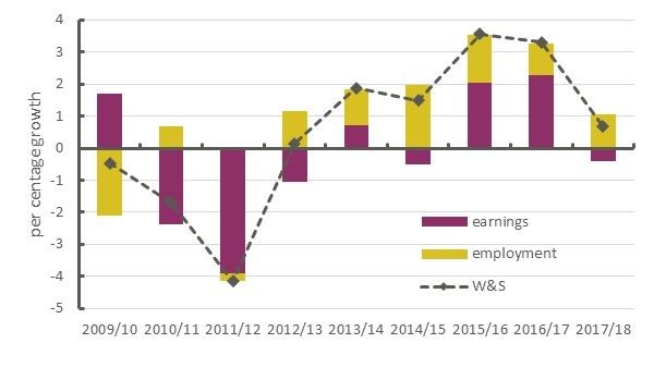
Since the financial crisis most gains in real wages and salaries have been driven by employment rather than earnings gains. In both 2015/16 and 2016/17 earnings made a more positive impact, but this will reverse in 2017/18 (the final figure on the chart) – because the ONS figures barely incorporate the surge in inflation since the EU referendum.
Overall, from the start of the coalition government in 2010/11 to the latest ONS disposable income figures for 2016/17, real earnings have declined by -2.8 per cent and employment has risen by 7.2 per cent.
So while it’s good that jobs are up, it shouldn’t be at the expense of lower wages. In the past, we had both and rising incomes were the norm.
Moreover it’s not clear that employment will continue to compensate for weak wage growth – job gains were weakening at end of last year.
No matter what the income figures say, Britain still desperately needs a pay rise.
Stay Updated
Want to hear about our latest news and blogs?
Sign up now to get it straight to your inbox