New evidence from the IMF suggests austerity is holding back wages
While since the crisis some countries have clearly had a more positive experience and others a catastrophically bad one, many countries are alike in sharing basically dismal outcomes. A comparison with figures for government spending (the IMF don’t do this), suggests that a significant factor in overall performance is the scale of austerity. There’s four steps of analysis needed to get to that conclusion.
STEP 1 The IMF wages- unemployment analysis
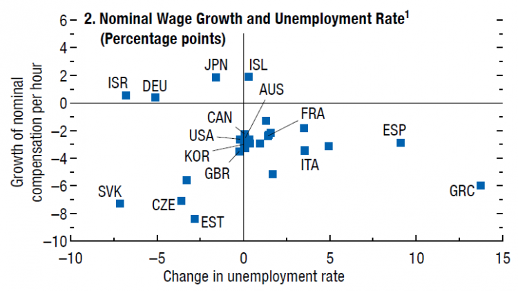
The IMF devoted a whole chapter of last week’s World Economic Outlook to exploring ‘wage dynamics in advanced economies’. An important chart (Figure 2.2 panel 2, below) compares changes in (nominal) wages growth with changes in the unemployment rate (with change measured as the difference between the 2016 figure and the 2000-07 average). The quadrants are the various combinations of improved/deteriorated wages/jobs performances.
Of most interest are those in the top left quadrant: the three countries where both unemployment improved and wages increased: Japan, Israel and Germany.
The UK government often tries to explain the dismal wages performance by setting it against a better jobs performance. This analysis shows very obviously that it is possible to have both (even if most don’t).
STEP 2 Ranking and combining unemployment and wages performances
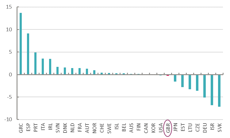
Using the underlying data (from here), unemployment and wages can be separately ranked by country. The UK is 8th from top on improved unemployment, though really is part of a large group of countries where the unemployment rate is very close to the rate before the crisis. However, the UK ranks 23rd of 28 when it comes to weaker earnings growth.
Change in unemployment rate, percentage points
Change in earnings, percentage points
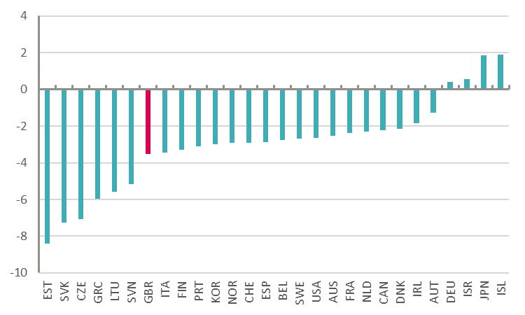
(Note that if the analysis were extended to the most recent periods, the UK unemployment result would be a little better but wages worse.)
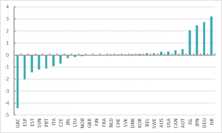
These figures can be combined into an overall score by ‘standardisation’. This is a way of bringing different measures onto a comparable scale, and is done by adjusting each set of figures for the average and the range of outcomes (standard deviation). Once the figures are standardised, the jobs result (reversing the sign, because a negative result is a good outcome for unemployment) is added to the wages result. The measure centres on zero, with many countries very closely matched – suggesting common experience – but then a handful of countries performing significantly above the norm and likewise below.
Measure of labour market performance, standardised
STEP 3 Assessing the severity of austerity
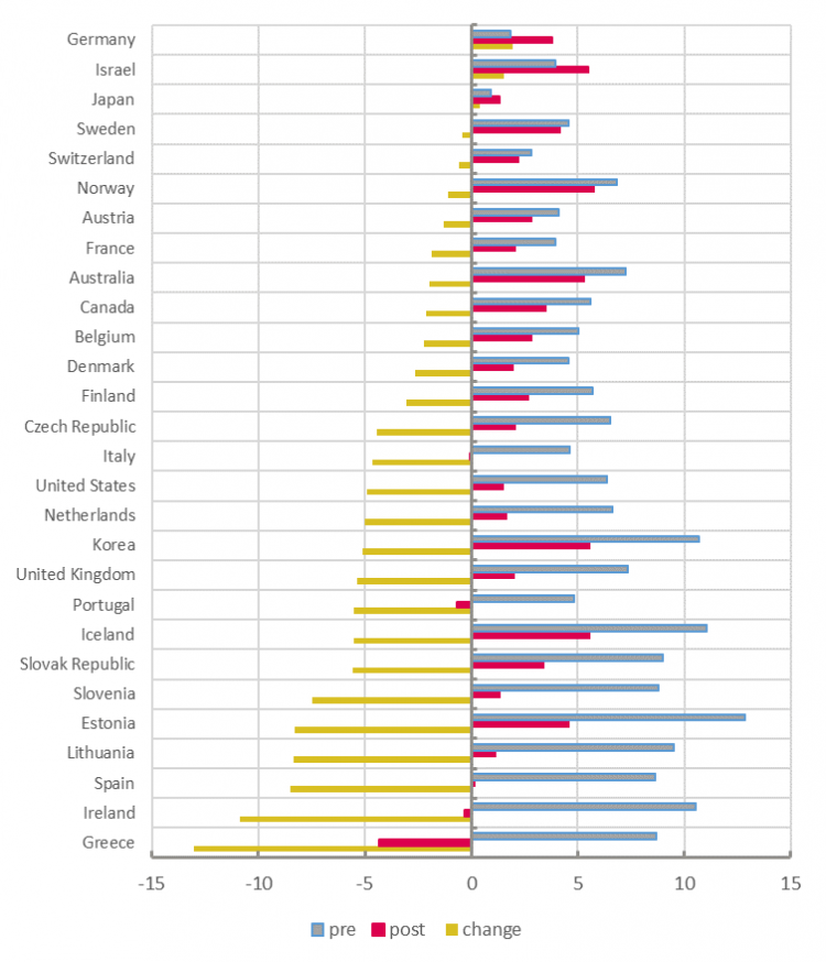
If we want to see whether this has anything to do with austerity, we need a measure for that too. As we argued here, for most countries ‘austerity’ has meant a cut in the growth of government expenditure (as opposed to simply a reduction in the level of government spending). The chart below shows spending growth before the crisis (2001-2008), after the crisis (2009-2016) and the difference. When the yellow rows are positive, spending growth has increased: (you guessed it) Israel, Germany and Japan. Only in Greece, Portugal and Ireland was spending growth actually negative in post-crisis years (crimson), i.e. the cash amount / level fell. There is a clustering of nine countries with government spending growth cut by between -4.5 to -5.5 percentage points a year, including the UK.
Government expenditure growth, per cent annual average
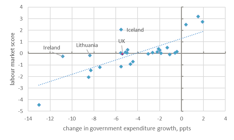
The final chart compares the change in government spending growth with the standardised measure of labour market performance. The match is a very good one (correlation: 0.76). I have labelled a few outliers and the UK (Israel, Germany and Japan are at the top and Greece, Spain, Estonia and Slovenia at the bottom).
Labour market outcomes vs austerity
You can stop here if you like. At this point, we know that there’s a close association between larger reductions in government spending growth, and lower wages and employment.
In terms of economics, the IMF seek to explain why “nominal [i.e. cash] wage growth in most advanced economies remains markedly lower than before the recession”.
Wage rates are defying conventional explanation. This holds that if unemployment is low, wages should be rising – and beyond a ‘natural’ rate of unemployment this has a problematic impact on wider measures of inflation. But this isn’t what’s happened. And despite supply side ‘labour market reforms’ over the years aimed at increasing productivity, it’s remained stubbornly flat –not least in the UK. It’s only when you start to take into account severely deficient demand that the picture starts to make sense.
As shown in previous work (e.g. here) weak government demand has meant weak economic growth. Weak growth translates as weak aggregate labour income, which is then allocated in the labour market between wages and employment. The differing allocations by country are of interest (and likely related to how extreme an approach to labour market flexibility), but the sum of the parts is determined by macroeconomic conditions. (Moreover, as suggested here the allocation distorts productivity calculations, so that productivity outcomes are merely a residual of processes dictated by demand.)
Current economic and labour market outcomes are perfectly consistent with an economic theory that emphasises demand, but unfortunately policymakers continue to insist only on a forensic assessment of supply. It is like dismantling the engine when your car has run out of petrol.
Stay Updated
Want to hear about our latest news and blogs?
Sign up now to get it straight to your inbox