Annex: Labour Market Stats Guide
Introduction
The TUC exists to change the world of work for good. That means we need to understand what is happening to workers across the economy. For trade unions the economy is the sum of what workers do. We are interested in all aspects of our working patterns, our rewards in terms of pay and conditions, and what happens when we are temporarily or permanently out of the labour market – whether unemployed, retired or in education or doing childcare. And we are interested in how these features have changed over time for the better or worse.
Understanding this means we need to think about the wider relations between the economy, the financial system and labour market. Under positive conditions, jobs growth and economic growth go hand in hand; when conditions deteriorate pay and jobs come under pressure. Since the global financial crisis of 2008-09 first jobs were hit and next, under austerity, came a pay crisis of unprecedented severity and duration.
A number of institutions produce figures and commentary on developments in the labour market, but our understanding is mainly informed by the Office for National Statistics in their monthly labour market statistics release and associated commentary. This briefing is based mainly on these data,[1] but also touches on forecasts issued amongst others by the Office for Budget Responsibility.
The ONS figures are based on various surveys, though broadly two kinds: surveys of households (mainly the labour force survey) and surveys of business (eg the monthly survey on wages and salaries). The figures are presented in a monthly release and set of high level tables that pull out the key aggregates (according in part to international definitions – not least the International Labour Organisation) and set out key features of work today.
Some commentary – particularly from economists – sets analysis of labour market data against preconceived (and right or wrong) economic ideas. For example, unemployment and wage figures may be set against what some economists believe are ‘natural rates’ for employment or wage growth in an advanced economy. Other outcomes might be set against economists’ forecasts, meaning for example a slowdown will be less surprising if it is already anticipated.
Sometimes events may expose limitations of the statistics themselves, for example in the past the use of administrative information to measure unemployment became misleading when the eligibility for benefits was changed. Today there is a concern that official statistics are not fully capturing a deterioration in the quality of work that has been a feature of the recent increase in employment.
But above all we want to know how well labour market outcomes meet our goal for all who want work to have good quality and well paid employment.
Employment status
There is an internationally agreed framework for understanding people’s employment status within the labour market. This includes agreed definitions of concepts like employment, unemployment and inactivity; and how they relate to each other.[2]
This diagram shows that the working age population is subdivided into economically active and inactive people. Those who are economically active are either employed or unemployed. Everybody else is inactive. These concepts are defined in more detail below.
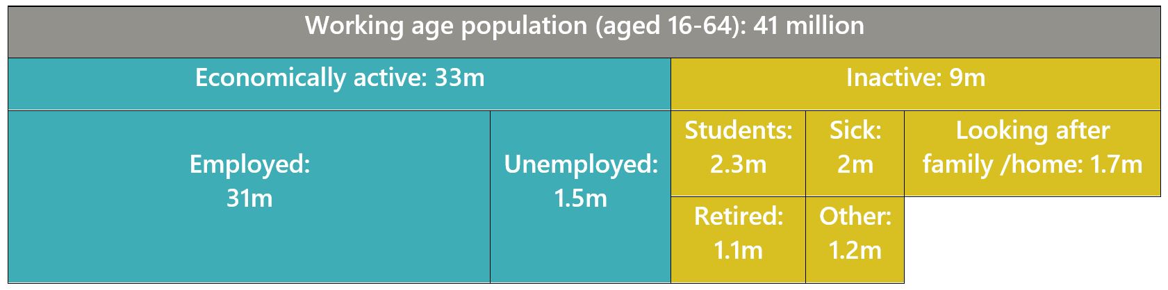
Employment
Employment measures the number of people who are in paid work.
They can be in employment, self-employment, or even temporarily away from a job which they expect to return to.
Unemployment
Unemployment counts the number of people out of work who are looking for a job.
The official definition is internationally agreed. It includes only those who have actively sought work in the last four weeks and are available to start work in the next two weeks; or are out of work, have found a job and are waiting to start it in the next two weeks.
Economically active
This includes everybody in employment and everyone who is unemployed, according to the above definitions.
Economically inactive
Economically inactive is used to describe everybody who is not working or looking for work. This can include retirees, students, carers, disabled people, and anybody not actively seeking work for any reason. Over recent decades, students have made up a bigger proportion of working age inactive people, and retirees and those looking after family/home has decreased.
Working age
The working age population counts all adults aged 16-64. This is useful for working out employment rates and other statistics.
Employment, unemployment and inactivity rates
Employment and unemployment are often reported as percentages or rates. This helps us to compare the labour market over time while accounting for changes in the population. These three graphs show the employment rate, unemployment rate and inactivity rate.
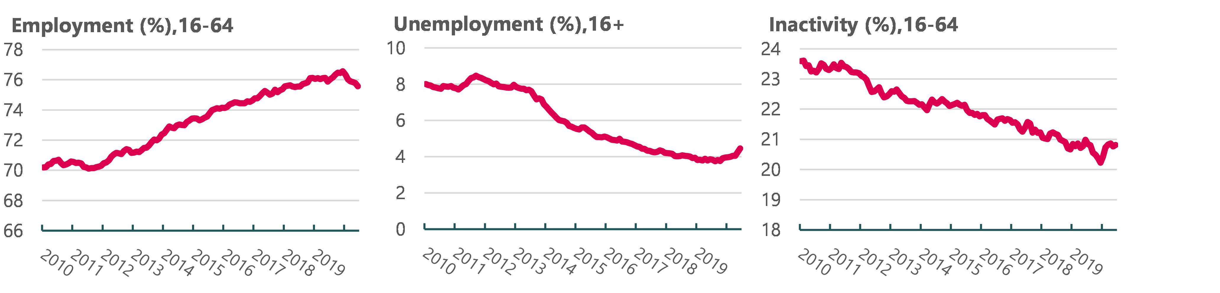
Employment rate
This tells us what proportion of working age people are in employment.
- Employment rate (%) = Employed aged 16-64 / Population aged 16-64
Unemployment rate[1]
This tells us what proportion of the economically active are unemployed. It tells us nothing about economically inactive people such as retired people, students and those not actively seeking work.
- Unemployment rate (%) = Unemployed aged 16+ / Economically active aged 16+
Inactivity rate
The inactivity rate tells us what proportion of the working age population is inactive.
- Inactivity rate (%) = Economically Inactive aged 16-64 / Population aged 16-64
Sources for employment status data
Labour Force Survey
The Labour Force Survey is the source for official measures of employment and unemployment for the UK. These headline statistics are published monthly. The LFS is the largest household survey in the UK and run by the ONS. It also asks detailed questions about all aspects of people’s work. More detailed releases are published quarterly.
Claimant Count
The claimant count uses administrative data to measures the number of people claiming benefits. It is sometimes used to understand changes in employment over time and between different groups and regions but is not always reliable. This is because it is heavily affected by underclaiming of benefits, and the move to Universal Credit which makes it harder to separate those claiming benefits due to unemployment or inactivity or low pay.
Employment composition
Beyond the headline employment numbers, the Labour Force Survey breaks down employment numbers in various ways.
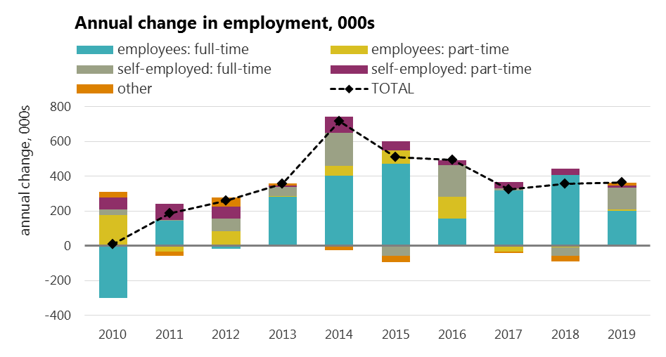
Employment or self-employment, full-time or part-time
The data allows us to explore how many people are full time or part time, and employee or self-employed. For example, it is possible to see the number of part-time self-employed. This data is produced every month and can be looked at over time.
The chart below looks at the composition of the change in annual employment: at the start of the decade self and part-time employment dominated, more recently the growth was in employee posts. In 2019 self-employment increased significantly. Subsequently, into the pandemic in 2020, self-employment posts have declined very rapidly.
Demographics
The data is also importantly broken down by gender, age and region for both employment and unemployment. Often the age composition is of great interest, with younger workers hit hardest by recession, and older workers joining the labour market more quickly over the most recent decade. While ethnicity and disability data is not available in the main monthly release, it is available from the Labour Force Survey on a quarterly basis. It is possible to do more detailed analysis using this quarterly data using the UK Data Service Nesstar catalogue[1] - the main platform for accessing LFS data. You do have to be registered and need to have limited training for this.
Underemployment
The main monthly release has information on temporary work, and also tells us the numbers who are in temporary work as they could not find a permanent job. Similarly, it tells us the number of those in part-time jobs as they could not find a full time job. These help show how the labour market is not delivering what workers want.
Insecure work
Data are also available on a quarterly basis on agency work, casual work, seasonal contract and fixed period contracts. And twice-yearly data on zero hours contracts are released.
The TUC also produces annual figures on insecure work.[2]
Other measures
Other useful information in the main monthly release include data on hours worked, numbers of redundancies and vacancies, and labour disputes.
Hours worked is a useful early indicator of changes in the labour market. During the early stages of the COVID-19 pandemic, hours dropped dramatically even though the Job Retention Scheme meant employment levels initially held up.
Redundancies and vacancies also give a useful insight into the health of the labour market. When redundancies are up and vacancies are down, unemployment is likely to follow.
Labour disputes data tells us how many days of work have been lost to strike action and the number of workers affected.
Pay
An important part of understanding the labour market is looking at people’s incomes. Wages were not in a good place at the start of the pandemic. The 2008 financial crisis and austerity policies led to a real pay squeeze that we still hadn’t recovered from when the pandemic hit.
Main sources of pay data
There are usually two main sources for data on real pay. These are both released by the Office of National Statistics (ONS) and both relate to employees and not self-employed.
Average weekly earnings (monthly)
The first is a monthly measure of average weekly earnings (AWE), based on the Monthly Wages and Salaries Survey (MWSS) which is a survey of employers. This is released as part of the monthly labour market release, and lets us see month-to-month changes in pay. The data lags two months behind its release date (e.g. the most recent data in October’s release will be for August).
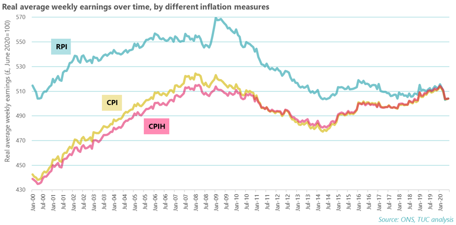
A nominal and real AWE figure is given. Nominal figures are broken down by sector and broad industry groups. The real AWE figure takes into consideration changes in the prices of goods (inflation), whereas the nominal figure doesn’t. The real figure is based on 2015 prices, and the ONS uses CPIH as the inflation measure. However, this isn’t the only way to adjust for inflation. At the TUC, we also look at CPI and RPI, and we tend to adjust based on current year prices.
The chart below shows real AWE adjusted by CPI, RPI and CPIH, and highlights how it’s important to be open and transparent about how you’re adjusting for inflation. Using a CPIH measure, as the ONS does, for example, means that real AWE came within £1 of returning to its pre-financial crisis peak. If using either CPI and especially RPI, however, real AWE was still some way off returning to where it was in 2008 even before the pandemic led to a new drop in wages.
Annual Survey of Hours and Earnings (annual)
The second source of data, the Annual Survey of Hours and Earnings (ASHE), is released in October. The survey is taken in April of each year, using data from HMRC’s PAYE records. While the data are less timely, it is more comprehensive, and offers a range of breakdowns, including detailed breakdowns by gender, age, occupation, industry, and region.
ASHE goes back to 1997, with some disruptions when occupational codes, industry codes and regional boundaries have changed. Before ASHE, the annual source was the New Earnings Survey.[1]
This all means that ASHE gives us a lot more insight into pay trends of specific groups, regions and industries, even if it is less timely.
Other sources of pay data
HMRC flash estimate (monthly)
Since the pandemic began, the ONS has begun to publish monthly estimates of pay taken from HMRC’s Pay As You Earn (PAYE) real time information data. This data is experimental, but is even more timely than AWE. This is also available by region, but by no other breakdowns.
The benefit of this data is that it only lags one month behind its release date, meaning that it’s more up to date than AWE.
Labour Force Survey (quarterly)
The quarterly Labour Force Survey (LFS) includes gross pay estimates. These are less reliable than AWE and ASHE pay data as they’re self-reported by employees. As well as this, the LFS allows responses by proxy, which increases the likelihood that responses may be inaccurate, and omits any responses where the response is over £100 per hour. The ONS warns that gross pay on LFS is therefore known to be an underestimate.
Despite not being as reliable as other pay data, LFS pay data is sometimes used as the LFS allows for demographic breakdowns, such as by ethnicity and disability, that aren’t available in any other pay data.
Jobs: Occupations and Industries
Labour market statistics also allow us to look at where people work, how many jobs are in particular sectors and industries, and the type of jobs people do. This allows us to map changes to industry employment and jobs over time as well as break down further to look at regional differences in employment and occupation, draw comparisons with economic performance measures such as output and look at the characteristics of the workforce in different industries.
The two most commonly used sources of statistics for industries and occupations are Workforce Jobs (WFJ) and the Labour Force Survey (LFS).
Main sources of jobs data
Workforce Jobs
Workforce Jobs is a quarterly measure of the number of jobs in the UK whereas the labour force survey can be used to measure the number of people who are in work (regardless of whether they have one or multiple jobs).
Typically, the number of jobs is always higher than the number of people in work – some people have multiple jobs. Latest workforce jobs data for Q2 (April-June 2020) reported 35,412,148 jobs across the UK. Whereas the number of people in employment for the same period was 32,77,8675.
Workforce Jobs is the preferred measure of looking at short-term changes in jobs by industry and is considered a more accurate indicator of industry jobs because it is drawn from industry surveys, supplemented by self-employment estimates from the LFS, and government supported trainees.
The chart below uses Workforce Jobs to show how many jobs there are in each industry. Changes over time are also greatly important – in the long term for example the shift from manufacturing, but more immediately those industries hardest hit by the pandemic.
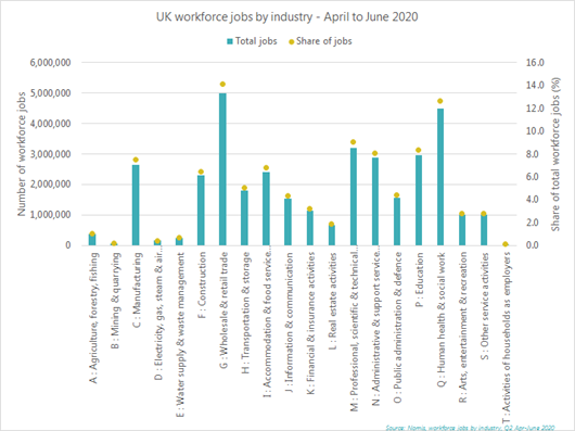
NB: This information can also be broken down by country and regions. The letters before each industry denote the Standard Industrial Classification Code, which is the code used to classify businesses, organisations and workers by the type of economic activity they are engaged with.
Labour Force Survey
While the Labour Force Survey is considered less accurate for industry breakdowns and changes to the number of jobs, it can be used to give a more comprehensive view of employment across the whole economy. While the LFS does have industry detail, these are regarded as less reliable than the employer surveys. However the LFS provides valuable information on the types of jobs people do (occupations) and who does them.
The example below shows employees (excluding the self-employed) split by major occupation group (9 categories) and gender. So for example, 9 per cent of all employees work in caring, leisure and other service occupations. Of women who are employed, 15 per cent work in jobs that would be categorised as a caring, leisure or other service occupations, as opposed to just over 3 per cent of men. Similarly, a much higher proportion of men work in skilled trades occupations than women.
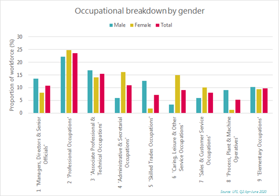
The LFS allows us to break down the 9 occupational categories further into specific types of jobs. We can also look at characteristics such as age and race to get a more detailed view of the demographics of workers in particular occupations. One challenge with breaking down into much more specific detail is that the sample sizes can become very small, which reduces the accuracy of the data, but it is still useful for identifying trends and overall themes within the labour market.
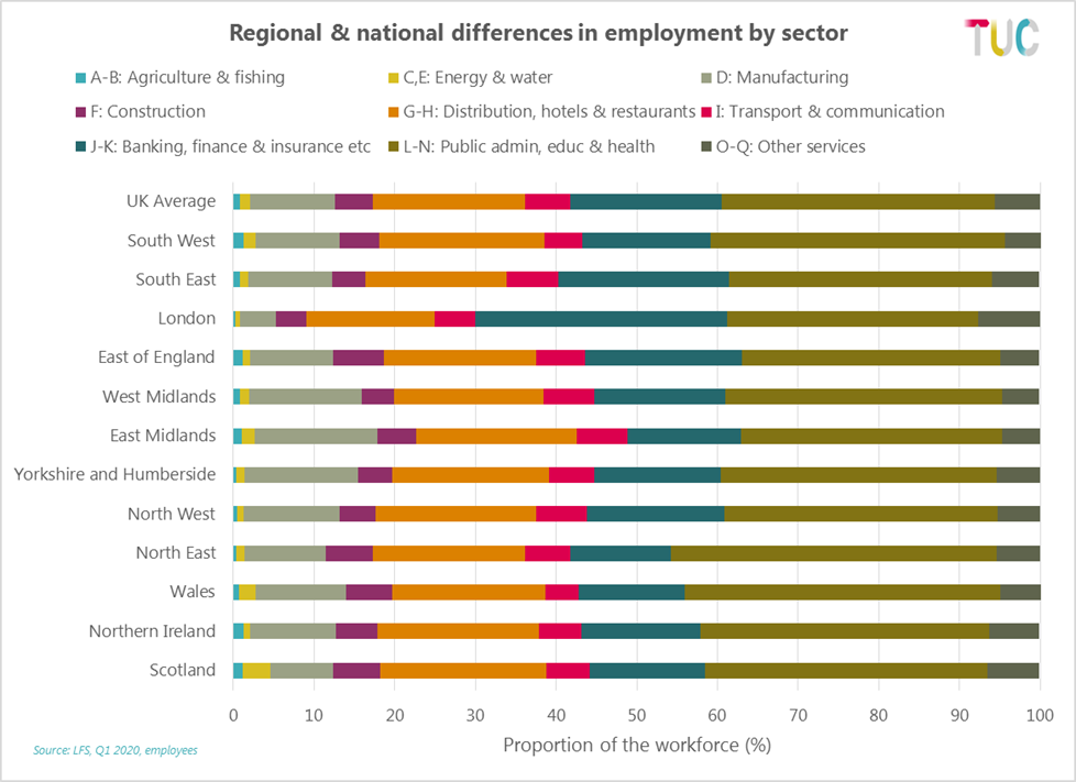
While the industry detail is less reliable, the LFS allows us to look at employment in different industries within regions and nations as well, allowing us to see the differences between them.
So for example in the chart below we can see that the North East has the highest proportion of its workforce employed in public admin, education and health (brown). Whereas London has a higher proportion of its workforce employed in banking, finance and insurance (dark blue).
International comparisons
The ONS also publish headline international comparisons of employment and unemployment rates for the European Union, the OECD, United States, Canada and Japan in their labour market data.
More detailed international data can also be found in the Organisation for Economic Cooperation and Development (OECD) database.[1]
The OECD provide country specific data and a range of employment measures that allow us to compare the current situation of different countries and the change in situation over time.
Some of the data you can look up includes:
- Employment & unemployment rates
- Earnings (gross, minimum wages and median wages)
- In work and out of work benefits
- Hours worked
- Job quality
- Trade union density
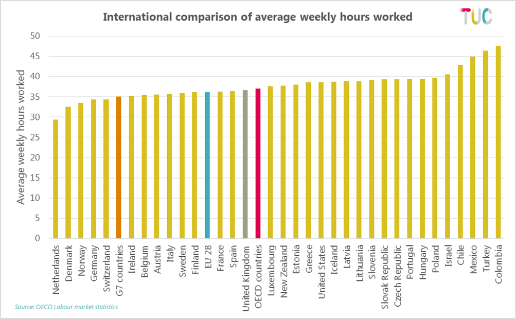
For example below we can see that in the UK, the average weekly hours worked by an employee is around 37 hours per week. This is higher than many European counterparts like Germany and the Netherlands, but roughly in line with the OECD average.
They also provide a regular employment outlook which summarises key trends and allows access to country specific summaries.
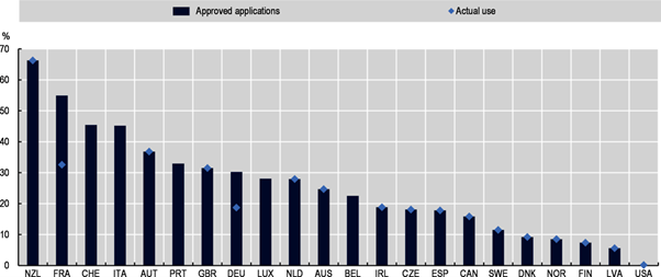
For example, in the latest Employment Outlook 2020, country specific data compares the participation in job retention schemes across OECD countries showing approved applications to the scheme and actual use. So in the UK for example, at the time of publishing just over 30% of employees where on furlough through the UK Coronavirus Job Retention Scheme (CJRS).
[1] ONS own (and more technical) briefing is here: https://www.ons.gov.uk/employmentandlabourmarket/peopleinwork/employmentandemployeetypes/methodologies/aguidetolabourmarketstatistics
[2] These definitions are not always the same as legal or tax definitions of employment status.
[3] It is worth noting that the unemployment rate is based on the population aged 16+ whereas the employment and inactivity rates are restricted to 16-64. This is because retired people would skew the employment and inactivity rates if those above retirement age are included. This does not happen for the unemployment rate which automatically excludes retired people.
[4] https://www.ukdataservice.ac.uk/get-data/explore-online/nesstar/nesstar.aspx
[5] TUC, Insecure Work, August 2020, https://www.tuc.org.uk/research-analysis/reports/insecure-work-0
[6] The ONS have published some longer-time series across both measures: https://www.ons.gov.uk/employmentandlabourmarket/peopleinwork/earningsandworkinghours/adhocs/006332newearningssurveynesandannualsurveyofhoursandearningsashepublicandprivategrossweeklytimeseries
[7] See the ‘Labour’ (and other sections) on https://stats.oecd.org/
Stay Updated
Want to hear about our latest news and blogs?
Sign up now to get it straight to your inbox